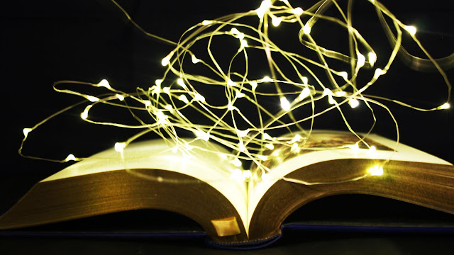
For this shoot, I wanted to use a light up object and the only one I had to hand was my Eiffel Tower. I decided to use fairy lights in a few of the photos to fill the negative space. By doing this, I was able to experiment with different sources of Artificial Light.
Research Artist
For this shoot, I was loosely inspired by Jack Hicks because I liked how he would use coloured lights to help emphasise the main aspect of the photo and make the photo seem more edgy. Also, I like how he took a different approach to using lighting in his work and I wanted to create something similar by using coloured lights instead of white ones.
Contact Sheet

Best Images

I like this photo because the colour of the light is not too overpowering and the light helps you see the pattern of the Eiffel Tower better. Also, I like how the Eiffel Tower is at a slight angle so you are able to see more of the structure compared to if it was face straight forward.

I like this photo because the green light helps the viewer clearly see the structure from the Eiffel Tower a lot more clearly. Also, I like how the camera is slightly zoomed out compared to other photos because you are able to see more of the structure, such as the arc at the bottom, adding more elements of interest for the viewer.
Worst Images

I don't like this photo because it is out of focus, I had the tower too close to the lens. Therefore, this made the photo unsuccessful because the viewer is unable to see the pattern of the metal on the Eiffel tower because the light is overpowering the photo.

I didn't like most of the photos with the red light because each time I would take the photo it would come out dark. It was difficult to change my settings for the red images because the Eiffel Tower would change colours every few seconds, therefore, not really giving me enough time to get the correct exposure.
AO1 - For this shoot, Jack Hicks was loosely the inspiration because I liked the way he would use the different gel/ coloured filters to get a more unique affect on the model. Due to certain circumstances I do not have access to the same resources, however I still wanted to experiment with coloured light. Therefore, I decided to find an object around my house that would light up in different colours to create a similar unique affect.
AO2 - For this shoot, I used my Canon 600D and set my ISO to 400, my shutter speed to 1/100 and my aperture to f5.6. I found that these settings allowed me to get the correct exposure for most of the coloured lights. Due to the Eiffel Tower changing colour every few seconds, this made it extremely difficult to get the correct setting/ exposure for each light, therefore, I had to find a setting that worked for the majority of them. I also used a tripod to help keep my camera steady and level between all of the photos and a dark back drop so the coloured lights would stand out even further.
AO3 - My idea for recording Artificial Light in this shoot was to present a different style (in this case colour) of light compared to what I have done before. In my opinion, this shoot has helped my slightly to progress further in my project because I have been able to expand my way of thinking about Artificial Light and present my work that has more variety in it. For this shoot, I wanted to capture colours in Artificial Lighting and I feel that I was able to do this in the photo with the green light (Best Image 2) because the light is clearly visible to the user and helps emphasise the features on the Eiffel Tower.
AO4 - I feel as if I have produced a series of photos that will help contribute to my final project because I was able to experiment with a different type of light by using coloured instead of white. This shoot will help expand my project further by being able to present more of a variety of Artificial Light instead of all being different sources of white light.
Manipulating My Images

For this project, I didn't want to heavily edit my photos because I wanted the main focus to be on the artificial lighting. Therefore I used settings such as vibrance, curves, contrast and levels to help emphasise the lighting more to make them stand out further to the viewer and drawing them in more. Also, I used burn and dodging in some areas of the photos to exaggerate some highlighted and shadowed areas so it would create more of a contrast and an extra element of interest. I also decided to crop the photo because I found the additional negative space around the Eiffel Tower to be distracting, therefore I got rid of it so the viewer can only drawn into the light and pattern from the tower.


No comments:
Post a Comment