Tuesday, April 28, 2020

Work Record 4

Work Record 5

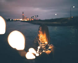
For this shoot, I wanted to use a light up object and the only one I had to hand was my Eiffel Tower. I decided to use fairy lights in a few of the photos to fill the negative space. By doing this, I was able to experiment with different sources of Artificial Light.

Research Artist

For this shoot, I was loosely inspired by Jack Hicks because I liked how he would use coloured lights to help emphasise the main aspect of the photo and make the photo seem more edgy. Also, I like how he took a different approach to using lighting in his work and I wanted to create something similar by using coloured lights instead of white ones.


Contact Sheet


Best Images


I like this photo because the colour of the light is not too overpowering and the light helps you see the pattern of the Eiffel Tower better. Also, I like how the Eiffel Tower is at a slight angle so you are able to see more of the structure compared to if it was face straight forward.


I like this photo because the green light helps the viewer clearly see the structure from the Eiffel Tower a lot more clearly. Also, I like how the camera is slightly zoomed out compared to other photos because you are able to see more of the structure, such as the arc at the bottom, adding more elements of interest for the viewer.


Worst Images


I don't like this photo because it is out of focus, I had the tower too close to the lens. Therefore, this made the photo unsuccessful because the viewer is unable to see the pattern of the metal on the Eiffel tower because the light is overpowering the photo.


I didn't like most of the photos with the red light because each time I would take the photo it would come out dark. It was difficult to change my settings for the red images because the Eiffel Tower would change colours every few seconds, therefore, not really giving me enough time to get the correct exposure.


AO1 - For this shoot, Jack Hicks was loosely the inspiration because I liked the way he would use the different gel/ coloured filters to get a more unique affect on the model. Due to certain circumstances I do not have access to the same resources, however I still wanted to experiment with coloured light. Therefore, I decided to find an object around my house that would light up in different colours to create a similar unique affect.

AO2 - For this shoot, I used my Canon 600D and set my ISO to 400, my shutter speed to 1/100 and my aperture to f5.6. I found that these settings allowed me to get the correct exposure for most of the coloured lights. Due to the Eiffel Tower changing colour every few seconds, this made it extremely difficult to get the correct setting/ exposure for each light, therefore, I had to find a setting that worked for the majority of them. I also used a tripod to help keep my camera steady and level between all of the photos and a dark back drop so the coloured lights would stand out even further.

AO3 - My idea for recording Artificial Light in this shoot was to present a different style (in this case colour) of light compared to what I have done before. In my opinion, this shoot has helped my slightly to progress further in my project because I have been able to expand my way of thinking about Artificial Light and present my work that has more variety in it. For this shoot, I wanted to capture colours in Artificial Lighting and I feel that I was able to do this in the photo with the green light (Best Image 2) because the light is clearly visible to the user and helps emphasise the features on the Eiffel Tower.

AO4 - I feel as if I have produced a series of photos that will help contribute to my final project because I was able to experiment with a different type of light by using coloured instead of white. This shoot will help expand my project further by being able to present more of a variety of Artificial Light instead of all being different sources of white light.

Manipulating My Images


For this project, I didn't want to heavily edit my photos because I wanted the main focus to be on the artificial lighting. Therefore I used settings such as vibrance, curves, contrast and levels to help emphasise the lighting more to make them stand out further to the viewer and drawing them in more. Also, I used burn and dodging in some areas of the photos to exaggerate some highlighted and shadowed areas so it would create more of a contrast and an extra element of interest. I also decided to crop the photo because I found the additional negative space around the Eiffel Tower to be distracting, therefore I got rid of it so the viewer can only drawn into the light and pattern from the tower.


Tuesday, April 21, 2020

Work Record 3

Work Record 4

For this shoot, I wanted to develop further from my previous shoot and used Disney themed object to help emphasise a magical element. So I found this light up flower from the movie Beauty and the Beast and used that to help portray Artificial Light.

Research Artist

For this shoot, I was inspired by Suren Manvelyan because I liked the way he would lights to add an extra element of interest and draw the viewer in more. Also, I like how he made his photos seem slightly more magical by adding them into the background.


Contact Sheet


Best Images


I like this photo because the light only shows part of the flower and also creates a lot of tone. The petals that cover the light directly, are the brightest and gradually blend into the darker area. This helps draws the viewer in more because of the additional formal elements. Also, I like how the light also emphasise the texture on the petals which helps add an extra element of interest.


I like this photo because I experimented on using more by using fairy lights as well. In my opinion, this created an interesting affect by the fairy lights reflecting off the case around the flower. This circular pattern helps draw the viewer into flower more because the fairy lights are surrounding it, and practically highlighting the flower as the key element. Also, I like how this photo fills up any negative space making the photo seem more fuller and complete.


I like this photo because there is a strong contrast between the lighter tones and the darker ones and almost making a mysterious atmosphere. Additionally, I like how the light emphasises the different patterns from the petals and leaves because it highlights a different formal element.


I like this photo because you are able to see majority of the rose and having it being placed in the centre of the frame it helps signify it's dominance. Also, I like how the the lights shine through it from the bottom creating an interesting affect because normally when light shines of flowers it is normally from an upwards angle. In my opinion, this makes the flower seem more delicate because the parts that are normally hidden in the shadows are now exposed.


I like this photo because it helps demonstrate how I was experimenting on how to create a different affect with light. For a few photos, I decided to use the fairy lights and quickly drag them up and down the frame to create a motion blur affect. By doing this, I was able to portray that I understand how to use Artificial Light in different ways to create interesting and unique affects.

Worst Images


I don't like this photo because it is too blurry, this is due to the flower being too close to the lens and the camera not being able to focus properly. Therefore, this photo is not successful because you cannot see any detail in the flower and the lights are too blurred to create the delicate appearance like it is in other photos.


I don't like this photo because it is underexposed and you are unable to make out much apart from a few lights and what is around it. This is happened because I only just started the shoot and I was still experimenting with different settings trying to figure out which ones would produce the best photos.


AO1 - For this shoot, I was inspired by Suren Manvelyan because I liked the way he would use fairy lights in the background of his photo to help emphasise the main features of the photo and help draw his viewers in more. I wanted to achieve something similar because the lights inside the case with the flower helps emphasise the texture of the petals. Also, I decided to experiment with this method by using different fairy lights and reflecting them off the case to help draw the viewer in more.

AO2 - I used my Canon 600D to take these photos and my ISO set to 400, however, when I brought in the additional lights I changed my ISO to 200. My shutter speed throughout this shoot was set to 1/100 due to being in a dark room I needed a the shutter to be open for a tiny bit more longer than I usually set it to so I could get the correct exposure of light. My aperture was set to f5.6 because I did not want the light to be too bright which caused the photo to look overpowering and highly exposed.

AO3 - My idea for recording Artificial Light was to take photos of objects with lights but not have the lights as heavily present in my previous shoot. I wanted to use subtle lighting and take photos focusing more on the texture and pattern of the object and how the light can easily shine through. I feel as if that I captured this idea in the photo where the light is shining through the petal and exposing its texture (Best Image 1) and by doing this I was able to capture a more fragile looking flower but its bold colours still show the strength and beauty. Also, by using more lights I was able to emphasise this idea by highlighting certain areas in the flower (Best Image 2).

AO4 - I feel as if I have produced a strong series of images because I have shown Artificial Light in a slightly different way. I was able to take my ideas from the previous shoot and manipulate it slightly to produce this shoot. Through this shoot I was able to present the idea of a flower looking fragile by shining a light through it and showing how easily exposed and thin the petal is but at the same time signify the rose's beauty by the light also emphasising the bold red colour (representing power).

Manipulating My Images


For this project, I didn't want to heavily edit my photos because I wanted the main focus to be on the artificial lighting. Therefore I used settings such as vibrance, curves, contrast and levels to help emphasise the lighting more to make them stand out further to the viewer and drawing them in more. Also, I used burn and dodging in some areas of the photos to exaggerate some highlighted and shadowed areas so it would create more of a contrast and an extra element of interest. I also used the healing brush tool because in one of the photos there was a led light that looked out of place and I wanted to get rid of it (Best Image 2). Also, I decided to crop one of the photos later because I wanted to create more of a concentrated photo where there are no other distractions from other elements.


Work Record 2

Work Record 3

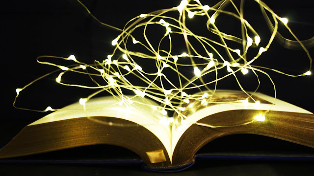
For this shoot, I decided to take pictures of fairy lights with books. I decided to do this because I found that it made the photos seem more like magic coming out of the books and demonstrate how books can transport you to somewhere else.

Research Artist

For this shoot, I was inspired by Suren Manvelyan because I liked the way he would lights to add an extra element of interest and draw the viewer in more. Also, I like how he made his photos seem slightly more magical by adding them into the background.


Contact Sheet


Best Images


I like this photo because the fairy lights are coming out of the book equally making the photo seem more symmetrical and balanced. Also, I like this affect because this seems like all of the words in the book are magical and coming out of the page instead of only a few. I like how the there are a lot of lights in this photo because this helps draw the viewer in more and follow the circular pattern they have created through the image.


I like this photo because it shows how I experimented with the lights by having a longer shutter speed and moving the lights which created a blurred light affect. I like this affect because it makes the photo seem more interesting because the light is practically bursting out of the page making the book seem that it has powerful and magical words. Additionally I like how I was able to experiment with this shoot because I was able to portray a variety of photos that looked interesting in different ways.


I like this photo because the lights are coming out towards the camera creating another layer to the image and filling up negative space. Also, the line that the fairy lights are on creates multiple leading lines towards the book and where majority of the lights are, therefore, dragging the viewers' eye through the whole image. This affect helps make the overall photo seem as if the magic is spilling out of the book and touching everything that is close to the book.


I like this photo because once again, the fairy lights create the affect that the lights are spilling out of the book continuously and spreading out into the world. Therefore, this could be interpretative to how the magic in books could make someones life more magical by the power of the story and where they transport the reader. This message in emphasised because this book is filled with fairy tales in far off kingdoms and contains a lot of magical elements, which could spread into the reader.

Wort Images


I don't like this photo because I didn't have the correct exposure, therefore the whole picture is dark. This spoils the magical affect because you are not able to clearly see the book or the lights clearly, therefore you are not able to see the same level of magic that the other photos do.


I don't like this photo because it is blurry, when taking this photo I accidentally knocked over my tripod. This doesn't help the magical affect because the viewer would not be focused on the lights coming out of the book, more of the fact that the photo is blurry and that has caused the photo to also look slightly overly exposed.


I don't like this photo because I tried to experiment with a different affect of only moving half of the lights and try to leave the other remainder still. In my opinion, this makes the photo look too busy and unpleasant to the eye because there is too much going on and you cannot focus on anything, therefore spoiling the magical affect.


AO1 - Suren Manvelyan was the photographer that helped influence my work because I liked the way he would use fairy lights and lights similar to make the most impact in his photos. His work inspired me to think about the positioning of the fairy lights in my photos to make the most impact. I was able to do this by laying the lights across the book and leading up towards the lens, this helps draw the viewer in more and makes the photo seem magical.

AO2 - For this shoot, I used my Canon 600D and set my ISO to 400 but for some of the photos where there was more light I changed the ISO to 200. Throughout this shoot, I set my aperture to f5.6 because I wanted as little as possible of additional light coming into the lens. For majority of this shoot, I set my shutter speed to 1/100 because I found that gave me the correct exposure for my work, and for the photos where I was moving the fairy lights around, I set my shutter speed to 1/4 so I could still see steaks of light and they didn't blur all together like one big light. I decided to use a tripod for this shoot because I knew my hands wouldn't of been steady enough to get a clear photo, also by using the tripod it allowed me to move around more freely to change the lights around.

AO3 - My idea for recording Artificial Light was to use fairy lights and place them on top of a fairy tale book to create a magical atmosphere. In my opinion, this shoot helped me produce more ideas for later shoot which made me more focused on my work instead of having a lot of different ideas that didn't really connect together. For this shoot, I wanted to capture how books can hold a lot of magic in them that can transport people into far off places. I feel like I was able to capture this idea in the photo where the fairy lights were equally distributed across the whole book (Best Image 1) because this shows how every single word holds power and magic. Also, I feel like this message has been emphasised in the photo where I experimented with the lights by moving them up and down (Best Image 2) because it seems as if the magic of the words are bursting out of the page, showing how powerful that can be.

AO4 - I feel as if I have produced a strong series of images because I have clearly shown Artificial Light and how to use it in different ways to produce a variety of photos that seem interesting. By doing this, I am able to show the viewer that I am able to manipulate and expand my way of thinking from my original idea and develop it to something new. Also, I feel like these images could be personal towards anyone by thinking back to their favourite book and how that transported them to a different place that they could control. However, these photos are personal to me because I enjoy reading and feel that more people should read to help them escape and I enjoy writing my own stories that could do the same for others that books I read does for me.

Manipulating My Images


For this project, I didn't want to heavily edit my photos because I wanted the main focus to be on the artificial lighting. Therefore I used settings such as vibrance, curves, contrast and levels to help emphasise the lighting more to make them stand out further to the viewer and drawing them in more. Also, I used burn and dodging in some areas of the photos to exaggerate some highlighted and shadowed areas so it would create more of a contrast and an extra element of interest.


Portfolio

Portfolio