Ann Miss Feklista
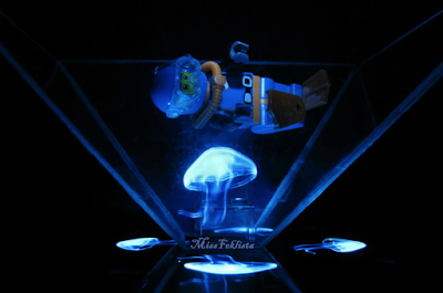
I like this photo because I like how she has used the lego toy to create the illusion that there is a person deep sea diving near a jellyfish. Also, I like how she always connects the toy to the hologram to show how she has thought all of this out carefully to make everything tie together and amuse the viewer slightly due to the creative idea.
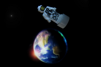
I like this photo because once again, Feklista has tied in the lego toy with the hologram by using the astronaut. This could present how far we have come in technology and society because we are now able to send people into outer space and we are constantly discovering something new about space each day.
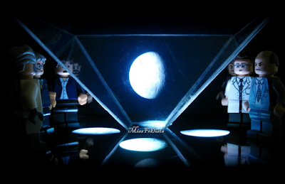
I like this photo because this reminds me on how we are still discovering something new about space and investigating more. Also, this makes me think of the 1960s when scientist was creating and discovering new ways on how to send our people to the moon and how the would all gather together and come up with new ideas until someone finally did it. However, this also gives me thought about an evil master mind plotting on how to destroy the world due to the lego character on the far right's facial expression.
Tuesday, April 28, 2020
Work Record 6
Work Record 8
For this shoot, I wanted to use a hologram prism tool I had already. By using this, I was able to capture a different style of Artificial Light and expand my ideas further.
Research Artist
This shoot was heavily inspired by Ann Miss Feklista because she had done something practically identical to what I wanted to do but her main focus was the lego toys (by advertising them for people to buy) with the hologram being an additional element of interest, when for me, the hologram is the main aspect of my photos for this shoot.
Contact Sheet
Best Images
I like this photo because you can clearly see the man and woman dancing together and I was able to position the video where the couple was standing close together. This gives the photo a more romantic and heartwarming feel that helps draw the viewer in. Also, this photo can personally relate to most people because they will be able to think of their loved one or their dream partner.
I like this photo because this hologram came out a lot more clearer compared to other holograms I tried to take photos of. Additionally, this photo helps demonstrate how I have taken Artificial Light and produced something completely different to what I have done before. Therefore, I will be able to produce a portfolio that draws the viewer in due to the variety of photos of I have.
I like this photo because I was able to take a clear photo of the diamond hologram so you are able to see the texture and pattern. This adds an extra element of interest because it gives the viewer more details to look at which is emphasised through the diamonds tone, the highlights towards the top of the diamond helps draw more attention.
I like this photo because the image looks simple by being a hologram of the earth, however, this holds a deeper meaning to it. As the viewer is looking at the earth, they will start to consider events on our own earth, both good and bad, and the longer they look at this photo the broader their thinking will become as they will think about events occurring more globally.
I like this photo because I was able to capture the hologram of a bird as if it was in mid-flight. I like how the body of the bird is extremely still but the wings are blurred, this helps emphasise the affect of the bird travelling fast and in mid-flight. Also, this helps create a graceful affect because the bird is able to keep the majority of their body still, almost creating a peaceful atmosphere.
Worst Images
I don't like this photo because I set my aperture correctly, therefore causing my image to be overexposed. Therefore, making this photo unsuccessful because you are unable to see any details on the butterflies wings and make the photo seem less realistic.
I don't like this photo because I set my shutter speed too quickly so this didn't allow enough light to get into the lens to get the correct exposure. Therefore, making this photo unsuccessful because the viewer is unable to see any details of the butterfly due to the photo being underexposed.
I don't like this photo because it is completely black, which occurred because I was too busy changing my settings my phone (where I was getting the visual images to create the hologram) switched off and I didn't realise until after I took the photo.
AO1 - This shoot was heavily inspired by Ann Miss Feklista because I had seen her work and many other people do something very similar before and I wanted to create something like this as well because I thought that it will show I know how the take Artificial Lighting and take a variety of photos. For this shoot I wanted to step away from the fairy lights and other types of genre like this and produce something new to show how I am able to experiment with the idea of Artificial Light.
AO2 - For this shoot, I used my Canon 600D and set my ISO to 400 and for some images I had to set my camera to 200. I had my aperture set to f5.6 and my shutter speed set to 1/60 because I personally found this gave me the correct exposure to see the hologram clearly. Once again, I used a small studio set up with a dark backdrop so the light was able to stand out a lot more from the harsh contrast. I also used a tripod because I knew that my hands would not of been steady enough to take a clear picture, also, I needed my hands free to set up and position each hologram for the photo. To create the hologram, I used a plastic pyramid and my phone which I set up a hologram video. The video had four separate videos of the exact same object that would reflect into the pyramid and produce the hologram.
AO3 - My idea for recording Artificial Light was to use light and create a hologram in a plastic pyramid. I wanted to expand my thinking of Artificial Light and take a step further from what I have previously been doing by demonstrating that I know how to use Artificial Light in multiple ways to produce that best possible and interesting outcomes. In my opinion, I feel as if I was able to achieve this in the photo where the couple was dancing (Best Image 1) because I was able to completely produce a brand new idea by still keep the idea of dreams (from the two people being in love) and peacefulness. Additionally, I feel as if I was also being able to project an important message like I have done in previous shoots with the photo of the earth (Best Image 4) by allowing the viewer to think of important events in the world which are happening now and how they could possible help.
AO4 - I feel as if I have produced a strong series of images because I am able to present a completely different perspective to what I have done before of Artificial Light. By doing this shoot, I will be able to expand my portfolio further and show the viewer I know and understand how to produce multiple ideas that tie into Artificial Light. Additionally, through this images, I was able to capture images of holograms that look very realistic and make the viewer more pulled in to look at them in more detail.
Manipulating My Images
For this project, I didn't want to heavily edit my photos because I wanted the main focus to be on the artificial lighting. Therefore I used settings such as vibrance, curves, contrast and levels to help emphasise the lighting more to make them stand out further to the viewer and drawing them in more. Also, I used burn and dodging in some areas of the photos to exaggerate some highlighted and shadowed areas so it would create more of a contrast and an extra element of interest. For some of my images, I decided to crop the photo so the image was more focused on the hologram instead of the additional negative space.
For this shoot, I wanted to use a hologram prism tool I had already. By using this, I was able to capture a different style of Artificial Light and expand my ideas further.
Research Artist
This shoot was heavily inspired by Ann Miss Feklista because she had done something practically identical to what I wanted to do but her main focus was the lego toys (by advertising them for people to buy) with the hologram being an additional element of interest, when for me, the hologram is the main aspect of my photos for this shoot.
Contact Sheet
Best Images
I like this photo because you can clearly see the man and woman dancing together and I was able to position the video where the couple was standing close together. This gives the photo a more romantic and heartwarming feel that helps draw the viewer in. Also, this photo can personally relate to most people because they will be able to think of their loved one or their dream partner.
I like this photo because this hologram came out a lot more clearer compared to other holograms I tried to take photos of. Additionally, this photo helps demonstrate how I have taken Artificial Light and produced something completely different to what I have done before. Therefore, I will be able to produce a portfolio that draws the viewer in due to the variety of photos of I have.
I like this photo because I was able to take a clear photo of the diamond hologram so you are able to see the texture and pattern. This adds an extra element of interest because it gives the viewer more details to look at which is emphasised through the diamonds tone, the highlights towards the top of the diamond helps draw more attention.
I like this photo because the image looks simple by being a hologram of the earth, however, this holds a deeper meaning to it. As the viewer is looking at the earth, they will start to consider events on our own earth, both good and bad, and the longer they look at this photo the broader their thinking will become as they will think about events occurring more globally.
I like this photo because I was able to capture the hologram of a bird as if it was in mid-flight. I like how the body of the bird is extremely still but the wings are blurred, this helps emphasise the affect of the bird travelling fast and in mid-flight. Also, this helps create a graceful affect because the bird is able to keep the majority of their body still, almost creating a peaceful atmosphere.
Worst Images
I don't like this photo because I set my aperture correctly, therefore causing my image to be overexposed. Therefore, making this photo unsuccessful because you are unable to see any details on the butterflies wings and make the photo seem less realistic.
I don't like this photo because I set my shutter speed too quickly so this didn't allow enough light to get into the lens to get the correct exposure. Therefore, making this photo unsuccessful because the viewer is unable to see any details of the butterfly due to the photo being underexposed.
I don't like this photo because it is completely black, which occurred because I was too busy changing my settings my phone (where I was getting the visual images to create the hologram) switched off and I didn't realise until after I took the photo.
AO1 - This shoot was heavily inspired by Ann Miss Feklista because I had seen her work and many other people do something very similar before and I wanted to create something like this as well because I thought that it will show I know how the take Artificial Lighting and take a variety of photos. For this shoot I wanted to step away from the fairy lights and other types of genre like this and produce something new to show how I am able to experiment with the idea of Artificial Light.
AO2 - For this shoot, I used my Canon 600D and set my ISO to 400 and for some images I had to set my camera to 200. I had my aperture set to f5.6 and my shutter speed set to 1/60 because I personally found this gave me the correct exposure to see the hologram clearly. Once again, I used a small studio set up with a dark backdrop so the light was able to stand out a lot more from the harsh contrast. I also used a tripod because I knew that my hands would not of been steady enough to take a clear picture, also, I needed my hands free to set up and position each hologram for the photo. To create the hologram, I used a plastic pyramid and my phone which I set up a hologram video. The video had four separate videos of the exact same object that would reflect into the pyramid and produce the hologram.
AO3 - My idea for recording Artificial Light was to use light and create a hologram in a plastic pyramid. I wanted to expand my thinking of Artificial Light and take a step further from what I have previously been doing by demonstrating that I know how to use Artificial Light in multiple ways to produce that best possible and interesting outcomes. In my opinion, I feel as if I was able to achieve this in the photo where the couple was dancing (Best Image 1) because I was able to completely produce a brand new idea by still keep the idea of dreams (from the two people being in love) and peacefulness. Additionally, I feel as if I was also being able to project an important message like I have done in previous shoots with the photo of the earth (Best Image 4) by allowing the viewer to think of important events in the world which are happening now and how they could possible help.
AO4 - I feel as if I have produced a strong series of images because I am able to present a completely different perspective to what I have done before of Artificial Light. By doing this shoot, I will be able to expand my portfolio further and show the viewer I know and understand how to produce multiple ideas that tie into Artificial Light. Additionally, through this images, I was able to capture images of holograms that look very realistic and make the viewer more pulled in to look at them in more detail.
Manipulating My Images
For this project, I didn't want to heavily edit my photos because I wanted the main focus to be on the artificial lighting. Therefore I used settings such as vibrance, curves, contrast and levels to help emphasise the lighting more to make them stand out further to the viewer and drawing them in more. Also, I used burn and dodging in some areas of the photos to exaggerate some highlighted and shadowed areas so it would create more of a contrast and an extra element of interest. For some of my images, I decided to crop the photo so the image was more focused on the hologram instead of the additional negative space.
Work Record 5
Work Record 6
For this shoot, I wanted to take photos of fairy lights in a clear glass jar to portray Artificial Light in a slightly different way to what I have done before. This shoot could end up making the lights like different due to being reflected through the glass weirdly.
Research Artist
For this shoot, I was inspired by Suren Manvelyan because I liked the way he would lights to add an extra element of interest and draw the viewer in more. Also, I like how he made his photos seem slightly more magical by adding them into the background.
Contact Sheet
Best Images
I like this photo because I was able to create a leading line from the edge of the frame going towards the glass vase using lights. This helps drag the viewers' eyes through the whole image and finally ends up at the to jar. I like this photo because it has a magical sensation to it by the lights seeming like fairies leading you towards this wonderland. Additionally, I like this affect because this could suggest how someone might follow this path towards their dreams, due to the magical atmosphere.
I like this photo because I have zoomed in close to the glass vase so you are able to see the heart more clearly. I like that I have done this because the lights have lit up the vase so you are able to see the texture and pattern of the heart which adds an additional element on interest that helps draw in the viewer more. Also, I like how I have zoomed in more because you can see all of the details in the glass and the lights, making some areas look slightly fragile, could represent how some people may not truly believe in their dreams and that thought process in portrayed on the glass.
I like this photo because the lights around the edge helps fill in the negative space around the vase like in other photos. Also, I like how one of the lights was close to the lens because it helps add another layer to the photo that the viewer has to look through. The lights that fill up the negative space kind of creates a leading line like the photo earlier creating a slight line, however it is not as clear compared to the photo earlier.
I like this photo because the viewer is able to truly focus on the glass vase and the lights inside instead of being distracted by other elements. I like this photo because once again it has a sense of magic to it and seems like a bottle filled with dreams and could suggest that the individual has so many dreams and goals that the bottle has started to overfill.
Worst Images
I don't like this photo because I had my aperture set too high therefore, the lights overpowered the whole image because it was overexposed. Also, due to the photo being overexposed, you are unable to see any details of the heart on the vase which was the main purpose of this photo particularly, therefore, making this photo unsuccessful.
I don't like this photo because again the photo is overexposed and the lights overpower the whole image. Also, I don't like this photo because the way the lights are positioned on the side of the vase makes the photo look slightly weird and unbalanced because in my opinion there should be a few more lights above the vase to help fill the empty space.
I don't like this photo because again it is overexposed and you are unable to see anything apart from the lights being blurred together as one. Also, I don't like this photo because I accidentally knocked over my tripod while taking this photo so it made the image extremely blurry and you are unable to make out the shape of the vase clearly, making this photo completely unsuccessful.
AO1 - This shoot was inspired by Suren Manvelyan but I this time I wanted to put my own twist on it. As I have stated in previous shoots, I like his photoshoot with the fairy lights in the background because it creates a sense of magic and peacefulness. I wanted to do something similar again but I wanted to make the fairy lights the main object in all of the photos for this shoot. To make the photos seem more interesting I used a class vase to create the illusion of bottled dreams.
AO2 - For this shoot, I used my Canon 600D and set my ISO to 400, shutter speed to 1/100 and my aperture to f5.6 because I found this gave me the correct exposure to be able to see all of the lights clearly. However, I did accidentally set my aperture to f8 when I fist started the shoot and didn't realise until part way through, hence why my first few photos are overly exposed. Once again, I used a small studio set up with a dark back drop to it would create a stronger contrast with the lights. I also used a tripod so I could focus more on the positioning of the lights and jar and know that my camera would already be set up and stay the same throughout the whole shoot.
AO3 - My idea for recording Artificial Light was to take photos of fairy lights in a vase to present the meaning of bottled dreams. Instead of of my previous shoots I've done, I wanted the fairy lights to be the main focus of the photos and the vase just as an extra element of interest. In my opinion, I feel that I have been able to achieve this appearance in the photo where I have created a leading line using the lights towards the vase where majority of the lights are (Best Image 1) and by doing this I was able to create the illusion of the viewer following the right path to reach their dreams. Also, I feel that I have been able to achieve this in the photo where I took a close up photo of the vase and lights (Best Image 2) because I feel as I have captured the deeper meaning of how dreams are fragile as you can see the scratches on the vase.
AO4 - I feel as if I have produced a strong series of images because I have been able to portray Artificial Light in a way that might intrigue the viewer by being drawn in through the deeper meanings of the images. Through these images, I was able to present the idea of bottled dreams and how one individual can have many dreams and goals they want to achieve but might be hard to attain them. I helped emphasise this message through the use of leading lines, trying to show the viewer that you need to find that one good path that can unlock everything that they wish.
Manipulating My Images
For this project, I didn't want to heavily edit my photos because I wanted the main focus to be on the artificial lighting. Therefore I used settings such as vibrance, curves, contrast and levels to help emphasise the lighting more to make them stand out further to the viewer and drawing them in more. Also, I used burn and dodging in some areas of the photos to exaggerate some highlighted and shadowed areas so it would create more of a contrast and an extra element of interest.
Work Record 4
Work Record 5
For this shoot, I wanted to use a light up object and the only one I had to hand was my Eiffel Tower. I decided to use fairy lights in a few of the photos to fill the negative space. By doing this, I was able to experiment with different sources of Artificial Light.
Research Artist
For this shoot, I was loosely inspired by Jack Hicks because I liked how he would use coloured lights to help emphasise the main aspect of the photo and make the photo seem more edgy. Also, I like how he took a different approach to using lighting in his work and I wanted to create something similar by using coloured lights instead of white ones.
Contact Sheet
Best Images
I like this photo because the colour of the light is not too overpowering and the light helps you see the pattern of the Eiffel Tower better. Also, I like how the Eiffel Tower is at a slight angle so you are able to see more of the structure compared to if it was face straight forward.
I like this photo because the green light helps the viewer clearly see the structure from the Eiffel Tower a lot more clearly. Also, I like how the camera is slightly zoomed out compared to other photos because you are able to see more of the structure, such as the arc at the bottom, adding more elements of interest for the viewer.
Worst Images
I don't like this photo because it is out of focus, I had the tower too close to the lens. Therefore, this made the photo unsuccessful because the viewer is unable to see the pattern of the metal on the Eiffel tower because the light is overpowering the photo.
I didn't like most of the photos with the red light because each time I would take the photo it would come out dark. It was difficult to change my settings for the red images because the Eiffel Tower would change colours every few seconds, therefore, not really giving me enough time to get the correct exposure.
AO1 - For this shoot, Jack Hicks was loosely the inspiration because I liked the way he would use the different gel/ coloured filters to get a more unique affect on the model. Due to certain circumstances I do not have access to the same resources, however I still wanted to experiment with coloured light. Therefore, I decided to find an object around my house that would light up in different colours to create a similar unique affect.
AO2 - For this shoot, I used my Canon 600D and set my ISO to 400, my shutter speed to 1/100 and my aperture to f5.6. I found that these settings allowed me to get the correct exposure for most of the coloured lights. Due to the Eiffel Tower changing colour every few seconds, this made it extremely difficult to get the correct setting/ exposure for each light, therefore, I had to find a setting that worked for the majority of them. I also used a tripod to help keep my camera steady and level between all of the photos and a dark back drop so the coloured lights would stand out even further.
AO3 - My idea for recording Artificial Light in this shoot was to present a different style (in this case colour) of light compared to what I have done before. In my opinion, this shoot has helped my slightly to progress further in my project because I have been able to expand my way of thinking about Artificial Light and present my work that has more variety in it. For this shoot, I wanted to capture colours in Artificial Lighting and I feel that I was able to do this in the photo with the green light (Best Image 2) because the light is clearly visible to the user and helps emphasise the features on the Eiffel Tower.
AO4 - I feel as if I have produced a series of photos that will help contribute to my final project because I was able to experiment with a different type of light by using coloured instead of white. This shoot will help expand my project further by being able to present more of a variety of Artificial Light instead of all being different sources of white light.
Manipulating My Images
For this project, I didn't want to heavily edit my photos because I wanted the main focus to be on the artificial lighting. Therefore I used settings such as vibrance, curves, contrast and levels to help emphasise the lighting more to make them stand out further to the viewer and drawing them in more. Also, I used burn and dodging in some areas of the photos to exaggerate some highlighted and shadowed areas so it would create more of a contrast and an extra element of interest. I also decided to crop the photo because I found the additional negative space around the Eiffel Tower to be distracting, therefore I got rid of it so the viewer can only drawn into the light and pattern from the tower.
For this shoot, I wanted to use a light up object and the only one I had to hand was my Eiffel Tower. I decided to use fairy lights in a few of the photos to fill the negative space. By doing this, I was able to experiment with different sources of Artificial Light.
Research Artist
For this shoot, I was loosely inspired by Jack Hicks because I liked how he would use coloured lights to help emphasise the main aspect of the photo and make the photo seem more edgy. Also, I like how he took a different approach to using lighting in his work and I wanted to create something similar by using coloured lights instead of white ones.
Contact Sheet
Best Images
I like this photo because the colour of the light is not too overpowering and the light helps you see the pattern of the Eiffel Tower better. Also, I like how the Eiffel Tower is at a slight angle so you are able to see more of the structure compared to if it was face straight forward.
I like this photo because the green light helps the viewer clearly see the structure from the Eiffel Tower a lot more clearly. Also, I like how the camera is slightly zoomed out compared to other photos because you are able to see more of the structure, such as the arc at the bottom, adding more elements of interest for the viewer.
Worst Images
I don't like this photo because it is out of focus, I had the tower too close to the lens. Therefore, this made the photo unsuccessful because the viewer is unable to see the pattern of the metal on the Eiffel tower because the light is overpowering the photo.
I didn't like most of the photos with the red light because each time I would take the photo it would come out dark. It was difficult to change my settings for the red images because the Eiffel Tower would change colours every few seconds, therefore, not really giving me enough time to get the correct exposure.
AO1 - For this shoot, Jack Hicks was loosely the inspiration because I liked the way he would use the different gel/ coloured filters to get a more unique affect on the model. Due to certain circumstances I do not have access to the same resources, however I still wanted to experiment with coloured light. Therefore, I decided to find an object around my house that would light up in different colours to create a similar unique affect.
AO2 - For this shoot, I used my Canon 600D and set my ISO to 400, my shutter speed to 1/100 and my aperture to f5.6. I found that these settings allowed me to get the correct exposure for most of the coloured lights. Due to the Eiffel Tower changing colour every few seconds, this made it extremely difficult to get the correct setting/ exposure for each light, therefore, I had to find a setting that worked for the majority of them. I also used a tripod to help keep my camera steady and level between all of the photos and a dark back drop so the coloured lights would stand out even further.
AO3 - My idea for recording Artificial Light in this shoot was to present a different style (in this case colour) of light compared to what I have done before. In my opinion, this shoot has helped my slightly to progress further in my project because I have been able to expand my way of thinking about Artificial Light and present my work that has more variety in it. For this shoot, I wanted to capture colours in Artificial Lighting and I feel that I was able to do this in the photo with the green light (Best Image 2) because the light is clearly visible to the user and helps emphasise the features on the Eiffel Tower.
AO4 - I feel as if I have produced a series of photos that will help contribute to my final project because I was able to experiment with a different type of light by using coloured instead of white. This shoot will help expand my project further by being able to present more of a variety of Artificial Light instead of all being different sources of white light.
Manipulating My Images
For this project, I didn't want to heavily edit my photos because I wanted the main focus to be on the artificial lighting. Therefore I used settings such as vibrance, curves, contrast and levels to help emphasise the lighting more to make them stand out further to the viewer and drawing them in more. Also, I used burn and dodging in some areas of the photos to exaggerate some highlighted and shadowed areas so it would create more of a contrast and an extra element of interest. I also decided to crop the photo because I found the additional negative space around the Eiffel Tower to be distracting, therefore I got rid of it so the viewer can only drawn into the light and pattern from the tower.
Tuesday, April 21, 2020
Work Record 3
Work Record 4
For this shoot, I wanted to develop further from my previous shoot and used Disney themed object to help emphasise a magical element. So I found this light up flower from the movie Beauty and the Beast and used that to help portray Artificial Light.
Research Artist
For this shoot, I was inspired by Suren Manvelyan because I liked the way he would lights to add an extra element of interest and draw the viewer in more. Also, I like how he made his photos seem slightly more magical by adding them into the background.
Contact Sheet
Best Images
I like this photo because the light only shows part of the flower and also creates a lot of tone. The petals that cover the light directly, are the brightest and gradually blend into the darker area. This helps draws the viewer in more because of the additional formal elements. Also, I like how the light also emphasise the texture on the petals which helps add an extra element of interest.
I like this photo because I experimented on using more by using fairy lights as well. In my opinion, this created an interesting affect by the fairy lights reflecting off the case around the flower. This circular pattern helps draw the viewer into flower more because the fairy lights are surrounding it, and practically highlighting the flower as the key element. Also, I like how this photo fills up any negative space making the photo seem more fuller and complete.
I like this photo because there is a strong contrast between the lighter tones and the darker ones and almost making a mysterious atmosphere. Additionally, I like how the light emphasises the different patterns from the petals and leaves because it highlights a different formal element.
I like this photo because you are able to see majority of the rose and having it being placed in the centre of the frame it helps signify it's dominance. Also, I like how the the lights shine through it from the bottom creating an interesting affect because normally when light shines of flowers it is normally from an upwards angle. In my opinion, this makes the flower seem more delicate because the parts that are normally hidden in the shadows are now exposed.
I like this photo because it helps demonstrate how I was experimenting on how to create a different affect with light. For a few photos, I decided to use the fairy lights and quickly drag them up and down the frame to create a motion blur affect. By doing this, I was able to portray that I understand how to use Artificial Light in different ways to create interesting and unique affects.
Worst Images
I don't like this photo because it is too blurry, this is due to the flower being too close to the lens and the camera not being able to focus properly. Therefore, this photo is not successful because you cannot see any detail in the flower and the lights are too blurred to create the delicate appearance like it is in other photos.
I don't like this photo because it is underexposed and you are unable to make out much apart from a few lights and what is around it. This is happened because I only just started the shoot and I was still experimenting with different settings trying to figure out which ones would produce the best photos.
AO1 - For this shoot, I was inspired by Suren Manvelyan because I liked the way he would use fairy lights in the background of his photo to help emphasise the main features of the photo and help draw his viewers in more. I wanted to achieve something similar because the lights inside the case with the flower helps emphasise the texture of the petals. Also, I decided to experiment with this method by using different fairy lights and reflecting them off the case to help draw the viewer in more.
AO2 - I used my Canon 600D to take these photos and my ISO set to 400, however, when I brought in the additional lights I changed my ISO to 200. My shutter speed throughout this shoot was set to 1/100 due to being in a dark room I needed a the shutter to be open for a tiny bit more longer than I usually set it to so I could get the correct exposure of light. My aperture was set to f5.6 because I did not want the light to be too bright which caused the photo to look overpowering and highly exposed.
AO3 - My idea for recording Artificial Light was to take photos of objects with lights but not have the lights as heavily present in my previous shoot. I wanted to use subtle lighting and take photos focusing more on the texture and pattern of the object and how the light can easily shine through. I feel as if that I captured this idea in the photo where the light is shining through the petal and exposing its texture (Best Image 1) and by doing this I was able to capture a more fragile looking flower but its bold colours still show the strength and beauty. Also, by using more lights I was able to emphasise this idea by highlighting certain areas in the flower (Best Image 2).
AO4 - I feel as if I have produced a strong series of images because I have shown Artificial Light in a slightly different way. I was able to take my ideas from the previous shoot and manipulate it slightly to produce this shoot. Through this shoot I was able to present the idea of a flower looking fragile by shining a light through it and showing how easily exposed and thin the petal is but at the same time signify the rose's beauty by the light also emphasising the bold red colour (representing power).
Manipulating My Images
For this project, I didn't want to heavily edit my photos because I wanted the main focus to be on the artificial lighting. Therefore I used settings such as vibrance, curves, contrast and levels to help emphasise the lighting more to make them stand out further to the viewer and drawing them in more. Also, I used burn and dodging in some areas of the photos to exaggerate some highlighted and shadowed areas so it would create more of a contrast and an extra element of interest. I also used the healing brush tool because in one of the photos there was a led light that looked out of place and I wanted to get rid of it (Best Image 2). Also, I decided to crop one of the photos later because I wanted to create more of a concentrated photo where there are no other distractions from other elements.
Subscribe to:
Posts (Atom)
Portfolio
Portfolio